Battle Bet: Digitizing the Arena Energy
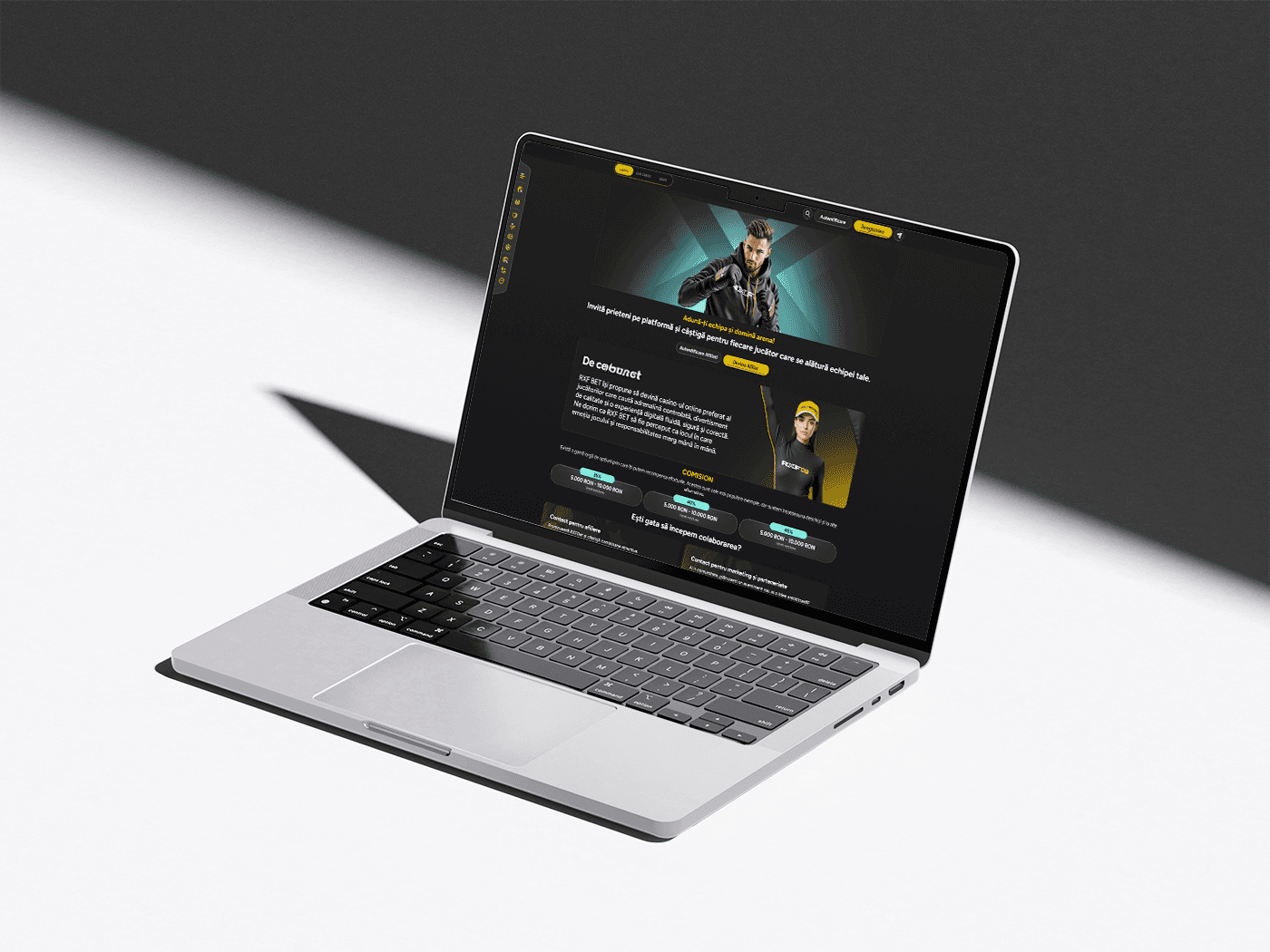
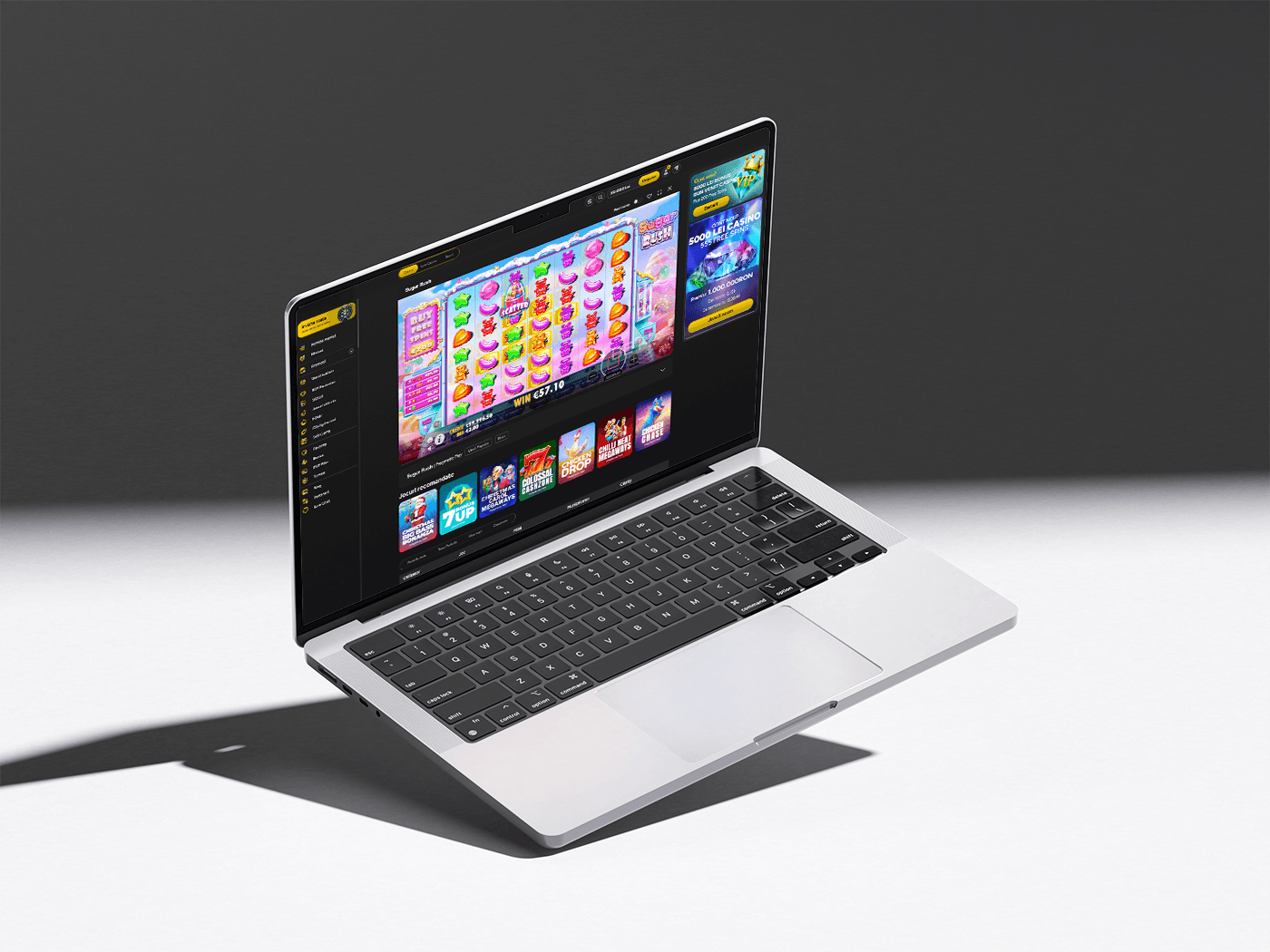
Battle Bet is a specialized mobile-first sports betting platform designed specifically around MMA fights, Romania's premier MMA promotion championship known for its celebrity matchups and high-octane entertainment.
Brasov, Romania
9 Months
2026
iGaming
TBD
500+
Challenges
As the digital extension of the Battle cage, the platform bridges the gap between entertainment-focused gala spectators and the online sports betting market. The core strategic initiative was to convert passive viewers into active players, securing a targeted 30% market share of the highly competitive Romanian iGaming landscape.
Cluttered interfaces: iGaming platforms are often overwhelming, making it difficult to quickly find odds or favorite games.
Lack of immersion: Many sites feel generic; BattleBet needs to visually convey the energy of cage fights, not just display numbers.
Friction in the betting process: Players miss critical moments due to an unintuitive bet slip or a cumbersome deposit flow.
Goals
Electrifying Visual Hierarchy: Using a clean yet impactful design that highlights key information without overwhelming the user.
“High-Stakes” Filtering Functions: Redesigning sorting options to help players find the right bets based on preferences, risk, and exclusivity.
Dynamic Navigation System: Optimizing access to Battle Live events and top games through a streamlined architecture.
Hypothesis 1
Proposed design: Reducing the number of steps required to complete registration and make the first deposit from 5 to 3 screens. Estimated impact: A 20% decrease in the onboarding abandonment rate within the first two months after launch.
Explanation: This hypothesis focuses on reducing initial friction; the shorter the process, the faster the user reaches the “thrill of the experience” we promise.
Hypothesis 2
Proposed design: Adding a quick-bet button directly within the live events list, allowing users to place a wager without opening the detailed match page. Estimated impact: A 15% increase in the number of bets placed during the final 5 minutes of sports events.
Explanation: In high-adrenaline moments, users look for a fast and convenient way to act. This feature turns the “thrill” into instant action.
Hypothesis 3
Proposed design: Introducing a visible progress bar for bonuses and rewards directly in the user account header.
Estimated impact: A 20% increase in the first 3 months retention for new players.
Explanation: Clear information and the visualization of personal benefits (such as loyalty points or progress toward a bonus) increase user satisfaction and encourage them to return to the platform.
Process
1st - Discover: I began by auditing the competitive landscape of both elite combat sports and digital gambling. This phase was about understanding the “high-roller” psychology, identifying the visual cues that trigger adrenaline in a fight fan and build trust in a casino player.
2nd - Define: In this step, I narrowed the focus to the BattleBet core values: prestige, power, and precision. I established the user personas, user stories, user journey and user flow’s from the casual viewer to the VIP gambler - ensuring the brand’s mission and vision acted as the north star for every technical requirement.
3rd - Ideate: To bridge the gap between casual entertainment fans and seasoned bettors, the ideation phase focused on stripping away traditional iGaming clutter and brainstorming features that replicate the high-stakes adrenaline of being cage-side. Here i did Crazy Eights & Low-Fidelity Sketching, Information Architecture (IA) Refinement, Feature Brainstorming & Prioritization
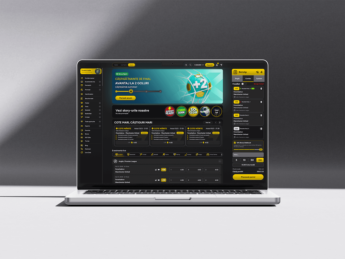
4th - Design: The design phase focused on turning conceptual ideas into a high-fidelity, interactive reality, carefully balancing a raw "fight night" aesthetic with optimal UI usability. In this phase i defined: Color Palette, Typography, Design System, Unique Features, Gamification, Bet Slips improvements, Responsive Layout and Mobile First optimization since 92% of the users are using mobile devices.
5th - Test: To validate the design framework and ensure it was capable of capturing 30% of the Romanian market, we launched a mixed-methods testing phase. This combined qualitative emotional insights with hard, quantitative behavioral data.
User research: Summary
Before sketching any interfaces, we needed to validate our assumptions about the Romanian gambling demographic. We launched a 3-week user research initiative combining quantitative market mapping and qualitative field data to understand behavioral patterns, income distribution, and platform frustrations.
Research Methodology by the Numbers
1 Screen Survey: Distributed to 250+ active users in Romanian sports-betting communities to categorize broad demographics (age, income, device preferences).
6 Semi-Structured Interviews: 45-minute deep-dives with active bettors in Bucharest and Cluj-Napoca to uncover emotional pain points and motivations.
Competitor Benchmarking: Heuristic evaluations of existing local platforms (Superbet, Betano) to see where user needs were being ignored.
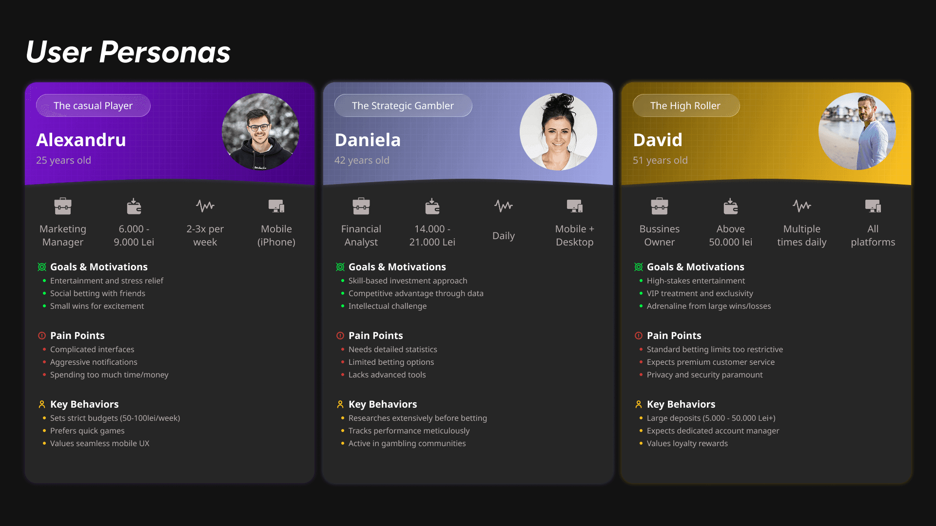
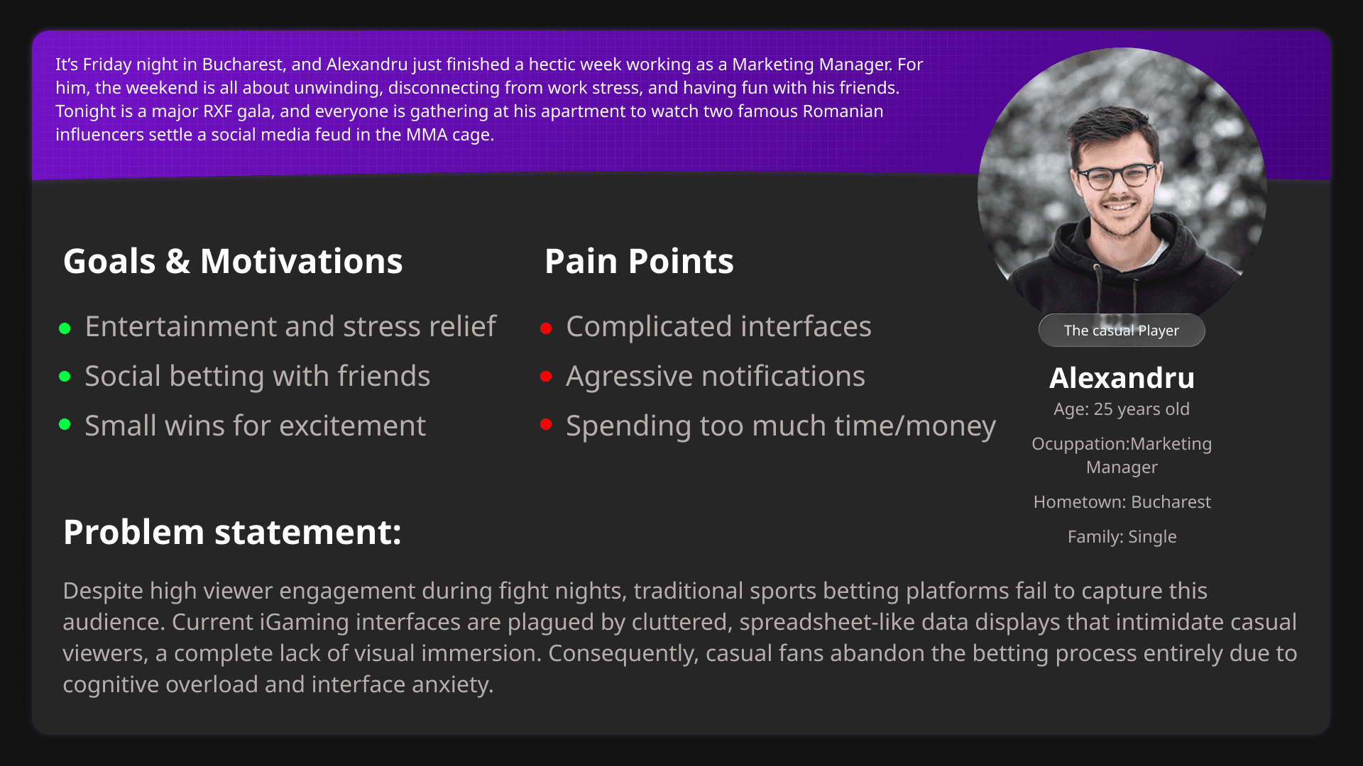
Key Research Findings: Through thematic analysis of our research data, users naturally grouped into three distinct archetypes based on their financial commitment, risk tolerance, and device behaviors:
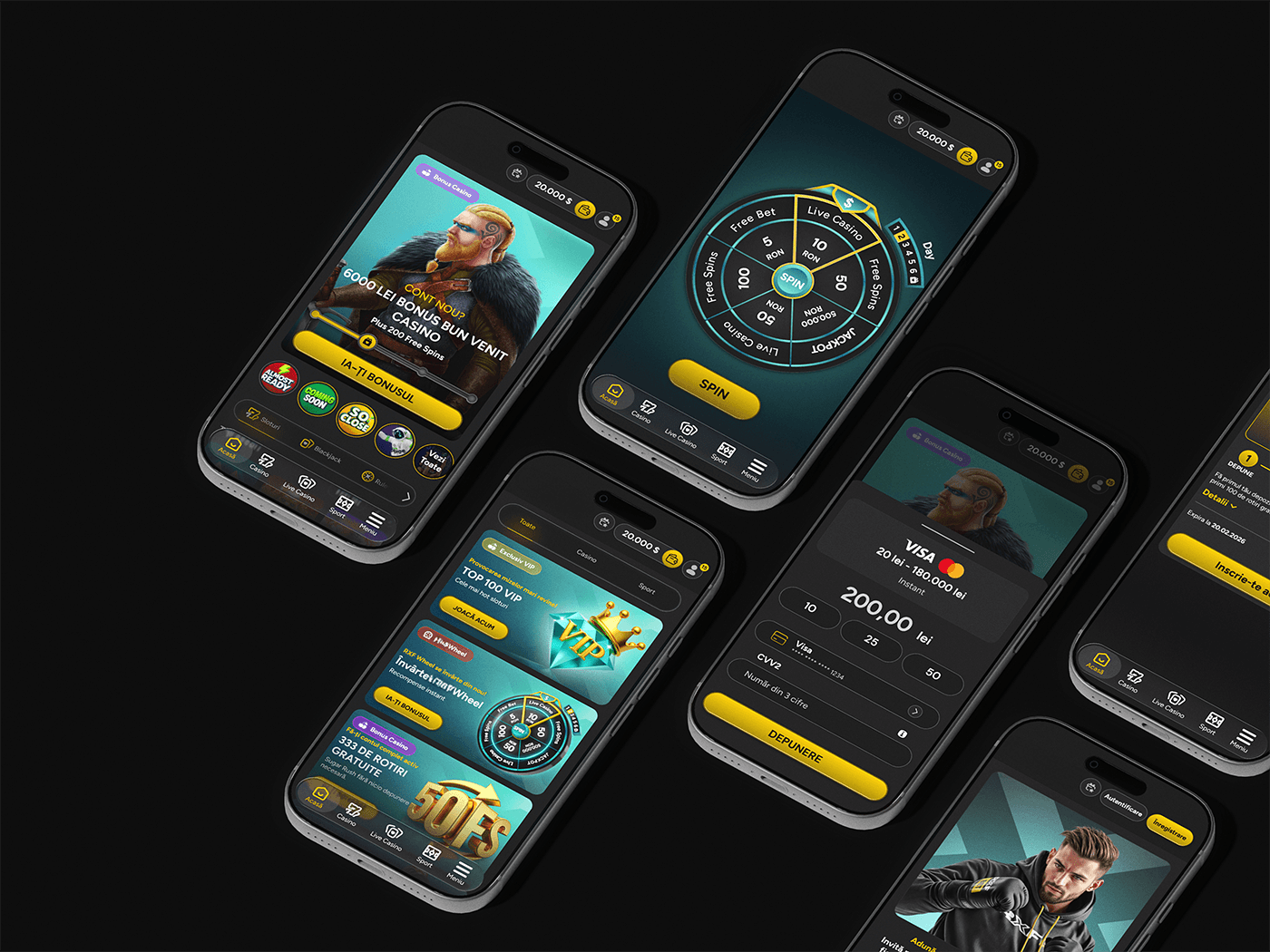
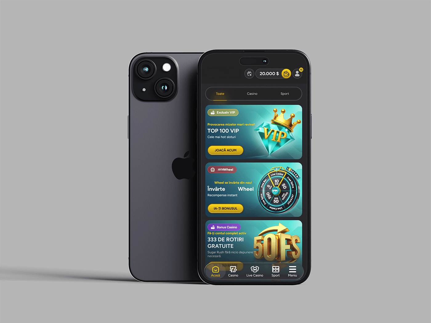
To design this interface, I structured the layout around a mobile-first, thumb-driven hierarchy optimized for rapid user engagement and conversion.
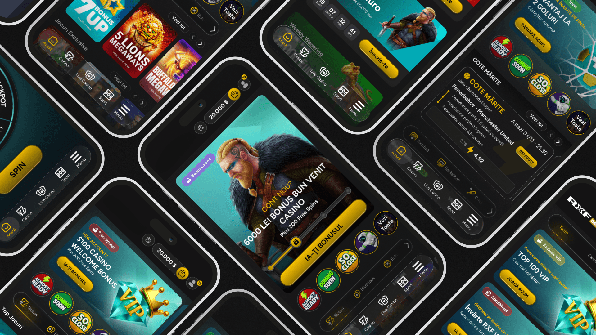
I began by establishing a clear vertical flow: a persistent Global Header at the top for immediate balance and profile awareness, followed by a high-impact Hero Component that commands the center of the screen to drive the primary call-to-action. Beneath the hero, I implemented a progressive disclosure system using horizontal carousels for quick category filtering, ensuring the screen remains clean and un-cluttered. Finally, I anchored the experience with a Sticky Bottom Navigation Bar to keep core app destinations within effortless reach of the user's thumb.
Key principles used: Visual Hierarachy ( The F and Z Shaped patter, Fitts's Law (Thumb Zone Optimization), Progressive Discolsure, Gamification.
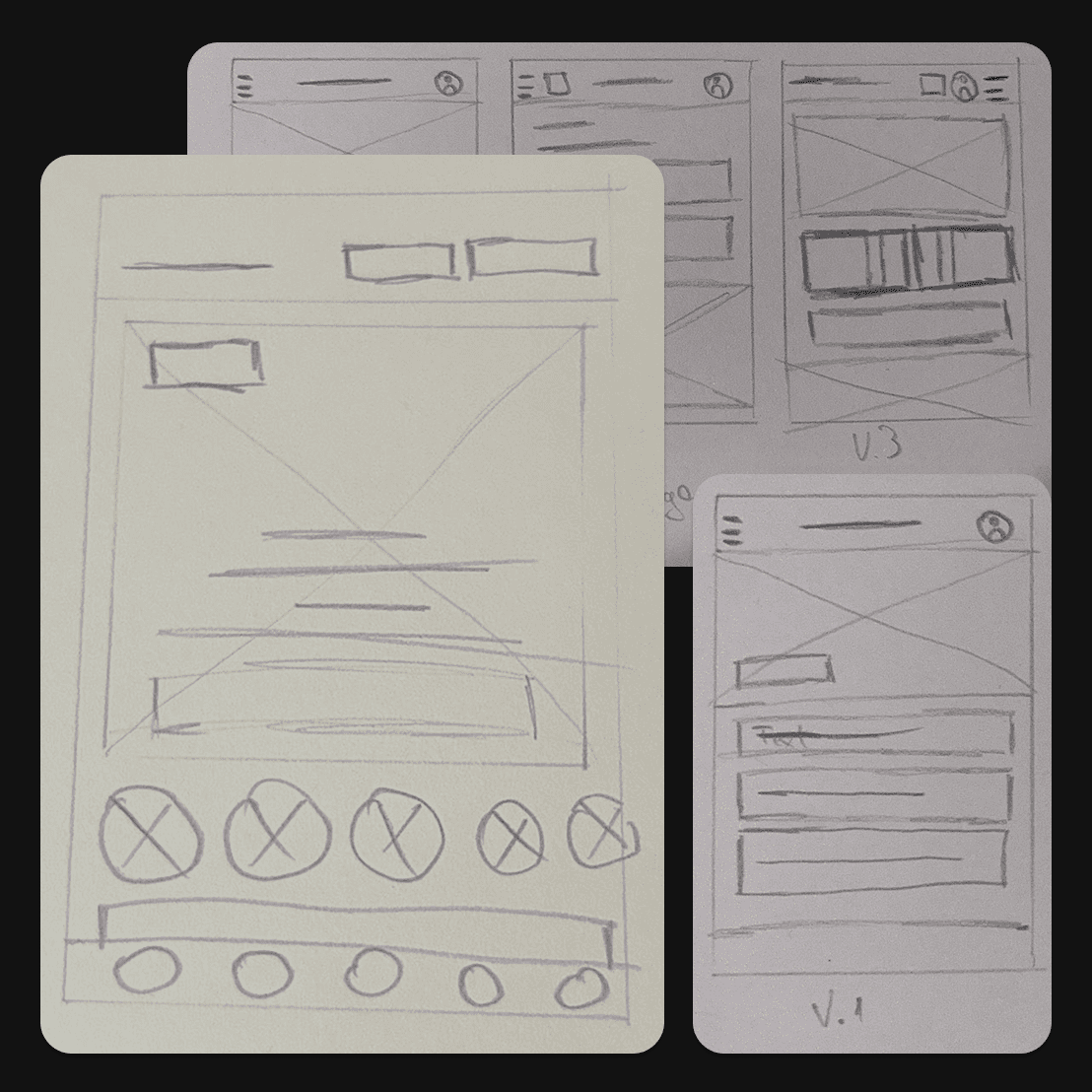

Transitioning from paper to digital was the bridge between layout exploration and interface architecture. On paper, the focus was purely ideation—determining how the hero banner, category filters, and sticky navigation should coexist. Digitally, that ideation was refined through the lens of usability. I stripped away hand-drawn noise in favor of a clean, grayscale component library, standardized typography scales, and realistic interactive states, turning static sketches into a functional blueprint that accurately mimics real mobile behavior.
Usability study: findings
What We Found:
Quantitative survey data from over 250+ users showed a massive preference for mobile-first betting. During the deep-dive interviews in Brasov, users expressed frustration with cluttered interfaces that require two hands to navigate safely while on the move.
Across all three user archetypes, the initial deposit and bonus claim process was a moment of high anxiety. Users want transparency regarding what they commit financially versus what they get in return.
Casual and mid-tier bettors feel overwhelmed by seeing hundreds of sports markets and casino games simultaneously on the home screen. However, high-volume bettors require rapid access to their favorite categories.
The Friction:
Competitor benchmarking (Superbet, Betano) revealed that many local platforms overcrowd the top half of the screen, making quick, one-handed bets during live matches physically awkward.
Local benchmarks showed that bonus terms are often buried in dense text, leading to user drop-off during onboarding due to a lack of trust.
Existing local apps rely heavily on deep vertical scrolling, forcing users to sift through irrelevant information to find what they want.
“ I worked alongside Gabriel for more than 5 years and I can confidently say he is an exceptionally creative, disciplined, and reliable professional.”

Roland Mureșan
UI/UX Manager, Dimsacon
https://www.linkedin.com/in/gabriel-ciubotariu-3866aa151/details/recommendations/
Conclusion
Designing this platform was a deep dive into balancing intense business goals with empathetic user design. By grounding the UI structure in solid research, distilling data from over 250 survey respondents and deep-dive interviews. I transformed a historically cluttered, overwhelming interface pattern into a streamlined, mobile-first experience. The final product successfully aligns user desires for clarity and accessibility with the platform's need for high engagement and smooth conversion loops.